HeadtoHeadFootball -
  • Home
  • NFL
  • NFL STANDINGS
  • STATISTICS
  • Soccer
  • Place Bet
  • Contact Us
HeadtoHeadFootball -
Home
NFL
NFL STANDINGS
STATISTICS
Soccer
Place Bet
Contact Us
  • Home
  • NFL
  • NFL STANDINGS
  • STATISTICS
  • Soccer
  • Place Bet
  • Contact Us
Soccer

GOAT Uniforms: The 10 best uniforms in sports history revealed

“If you look good, you play good.” – Deion Sanders

theScore is counting down the 100 best uniforms in sports history, with a new post every weekday until May 15.

100-91 | 90-81 | 80-71 | 70-61 | 60-51
50-41 | 40-31 | 30-21 | 20-11 | 10-1

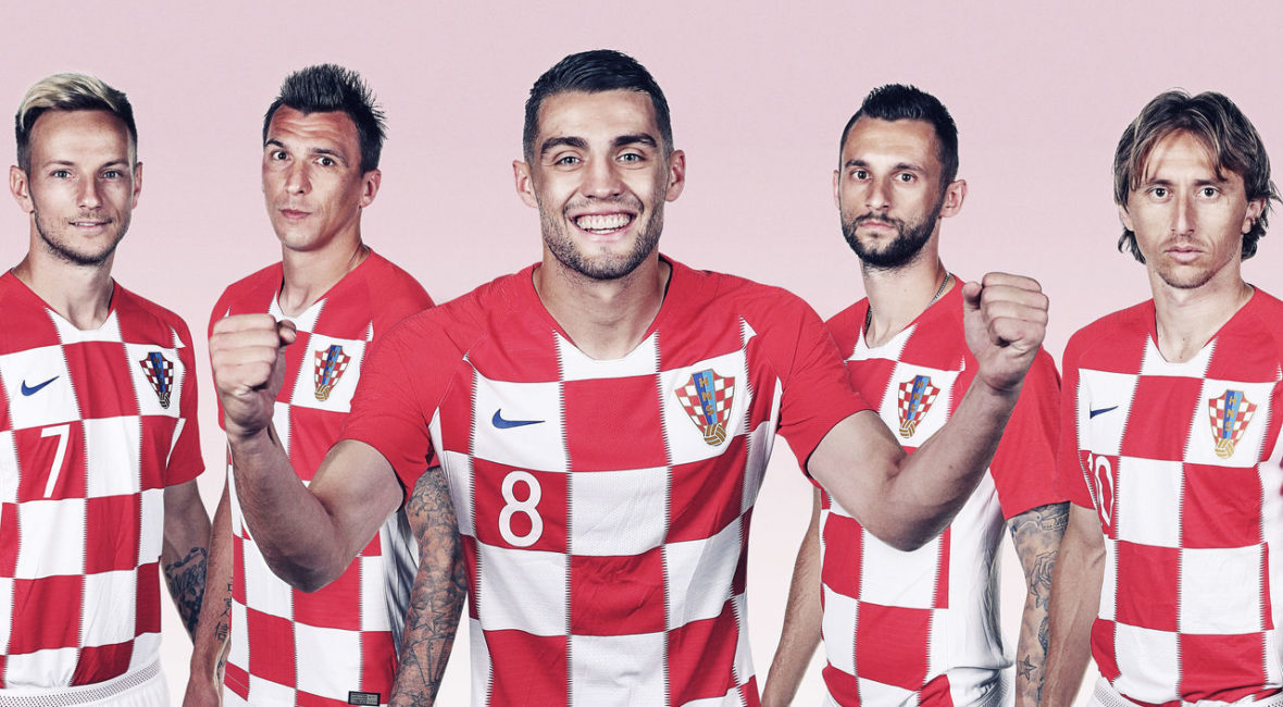
10. Croatia (current)

FIFA / FIFA / Getty

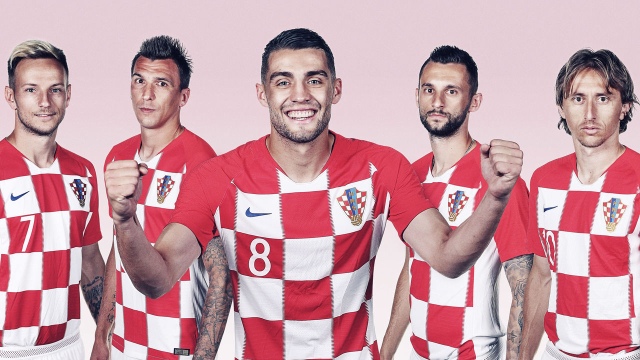
We kick off our top 10 with a uniform that, for many, will be a surprising inclusion. There is a wealth of unique and timeless kits among international soccer teams, but Croatia’s distinctive look stands above all others. The red and white checkered pattern has been compared to a chessboard, a tablecloth, and even the Purina pet food logo. However, the motif is actually based on the country’s coat of arms, a tremendous source of pride for Croatians.

9. San Diego Chargers (1960s)

Richard Stagg / Getty Images Sport / Getty

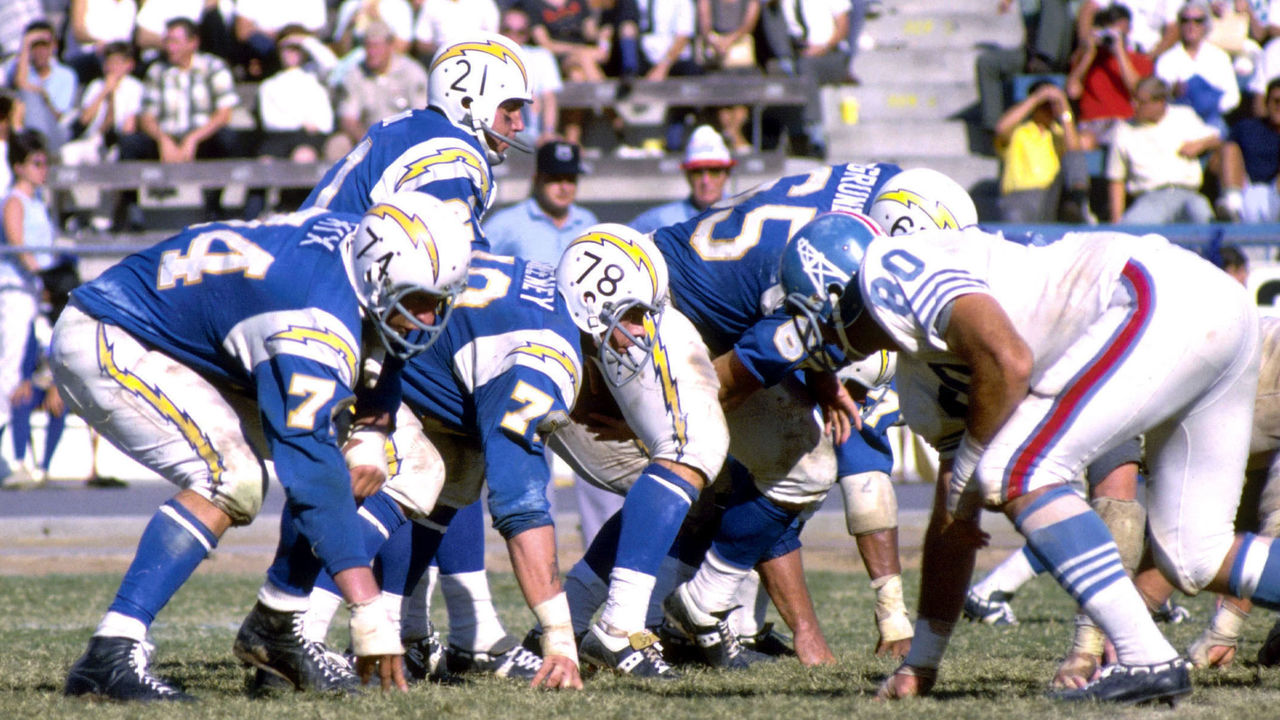
The Chargers’ uniforms have been tweaked and redesigned many times over the years, rarely producing an unappealing result. Many fans are often torn between the royal blue helmets and yellow pants of the 1970s, the navy blue base and white lightning bolts of the 1990s, or the navy and powder blue combo sported by the team until last month’s redesign that aimed to combine all the eras. But for us, and it’s fair to say for most others, the Chargers have never looked better than they did in the mid-1960s. Lightning bolts as stripes might be a little hokey if they weren’t so damn cool.

8. Chicago Blackhawks (current)

Jonathan Daniel / Getty Images Sport / Getty

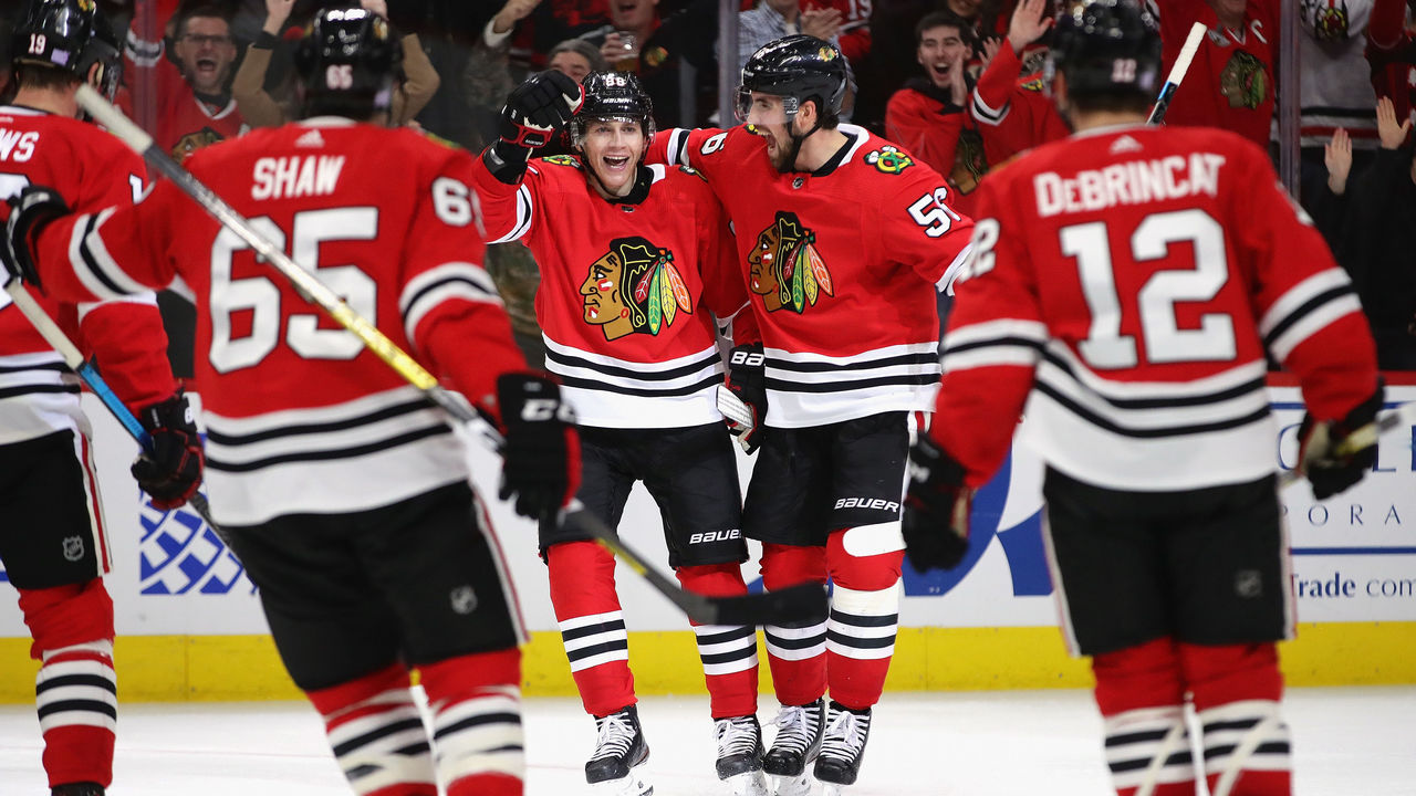
Thanks to three Stanley Cups from 2010 to 2015, the Blackhawks’ timeless style – which more or less has been the same since 1955 – regained clout. Chicago lost its place among hockey’s top franchises thanks to shoddy ownership before its resurgence last decade. However, the club has always looked great on the ice through it all. The vibrant home red jersey, complemented by matching double stripes at the elbow, waist, and socks, has long been one of the best in hockey. Factor in the beautifully colorful crests on the front and shoulders, and the Blackhawks’ everlasting aesthetic is undeniably great.

7. San Francisco 49ers (current)

Icon Sportswire / Icon Sportswire / Getty

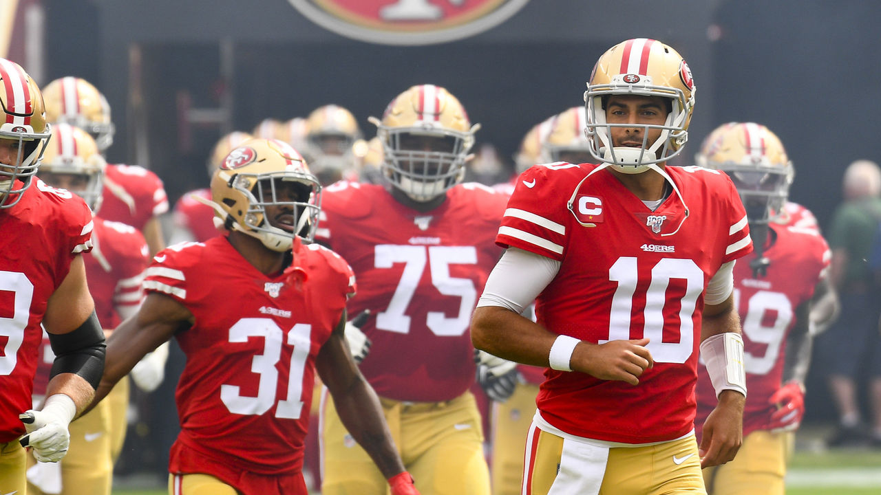
Joe Montana made the 49ers’ persona famous as he dominated the 1980s, and after an experiment with black accent colors – a trap they certainly weren’t the only to fall into – for the decade-plus that followed, San Francisco’s look is back as it belongs. A simple red jersey is brought to life with gold helmets and pants, consistent striping patterns, and the aura of an unforgettable dynasty that produced some of football’s most famous moments. When the Niners rock their reds under the Bay Area sun, they practically glow.

6. Notre Dame (current)

Icon Sportswire / Icon Sportswire / Getty

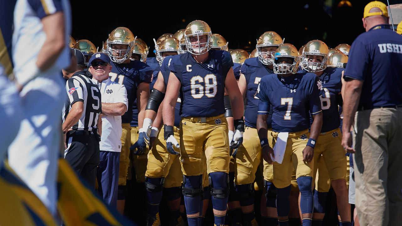
There are no neutral feelings toward Notre Dame. The Fighting Irish have one of the largest and most loyal followings in America, but if you don’t fall on the supporters’ side, there’s a good chance you despise everything about their football program. Love them or hate them, we can all agree Notre Dame looks good. Navy and gold – 24-karat gold, in fact, for the fabled blank helmets – is all Notre Dame needs to deliver the best look in college football.

5. Los Angeles Lakers (1980s)

Andrew D. Bernstein / National Basketball Association / Getty

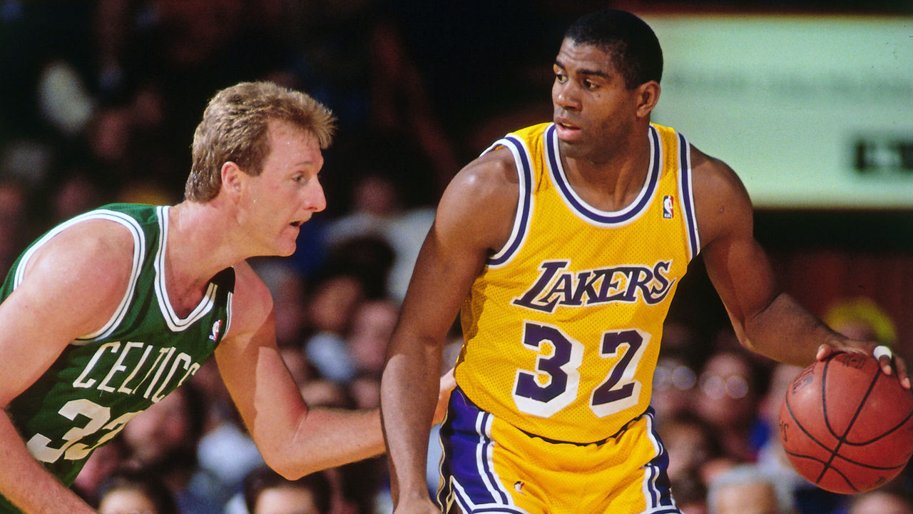
The Lakers not only won five championships in the 1980s, but they also created the NBA’s most recognizable and globally popular uniform. The digs worn by Magic Johnson and Co. are the quintessential Los Angeles design, featuring a famous drop shadow on the purple numbers the club moved away from during the Kobe Bryant era, which coincidentally yielded five titles, as well. But when LeBron James came to town, L.A. brought back its old look, but today’s jersey sponsorships and other minor details don’t quite match the lore that surrounds the “Showtime” Lakers.

4. North Carolina basketball (1990s)

Andy Lyons / Getty Images Sport / Getty

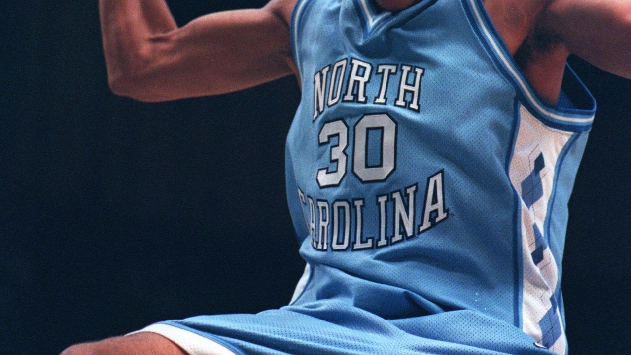
The Tar Heels’ “Carolina blue” has always looked amazing, but legendary head coach Dean Smith wanted something new in the 1991-92 season, and designer Alexander Julian introduced the world to the argyle pattern still used and revered in 2020. There have been several gorgeous renditions since, but UNC’s original redesign – also accompanied by a bigger, bolder wordmark and more detailed trim than on today’s uniforms – gets the nod for the best look the storied university has ever used.

3. New York Yankees (current)

Mike Stobe / Getty Images Sport / Getty

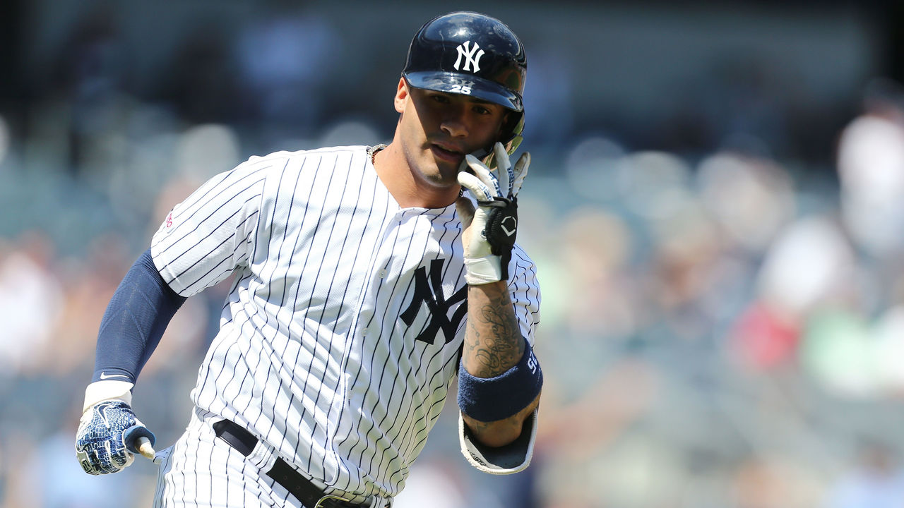
There aren’t many elements to these uniforms, but every single one of them – the pinstripes, the interlocked “NY” on the cap and over the heart, and the absence of player names on the back – is iconic. Would these rank so high if the Yankees achieved a similar level of success as the Detroit Tigers (another team with a simple and timeless uniform) and not won 27 World Series titles? It’s impossible to say, as you can’t separate the memories of all the Bronx Bombers legends who’ve worn this uniform over the last century from the design itself. Pinstripes have become, and will always be, synonymous with greatness.

2. Montreal Canadiens (current)

Icon Sportswire / Icon Sportswire / Getty

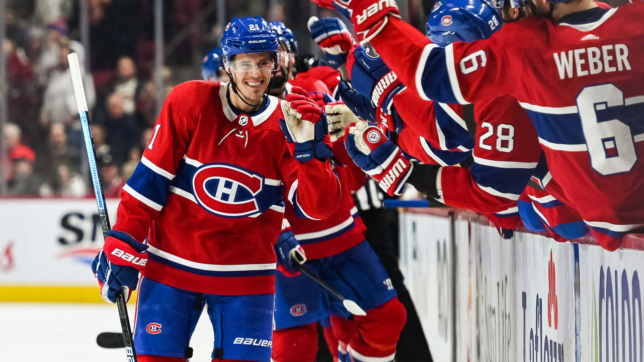
The most untouchable uniform in all of hockey. The Canadiens’ classic red sweater has been almost exactly the same since the dawn of the NHL in 1917, and its signature touch is the blue stripe around the middle, creating the perfect backdrop for a logo that’s also undergone minimal changes for more than a century. Montreal’s uniform scheme is so iconic that the club has opted to make use of a third jersey only once, and while the Habs’ look has slightly modernized over time, aspects of their historic getups – namely, the white collars and laces – have rightfully lived on. There’s simply no team that does tradition like the Canadiens.

1. Las Vegas Raiders (current)

Jed Jacobsohn / Getty Images Sport / Getty

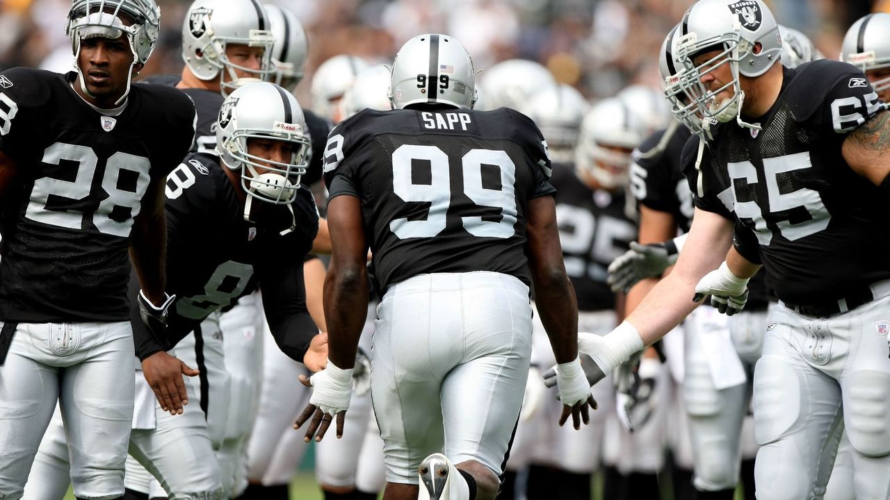
The Raiders have made plenty of mistakes on and off the field over their history in Oakland, Los Angeles, Oakland again, and now Las Vegas. But one thing they got exactly right was their uniforms. The black and silver debuted in 1963 – following a three-year stint during which the team used gold instead of silver – and hasn’t been touched since. Players put on these uniforms and instantly take on a menacing villain aura, which is exactly the mindset you want when brute force and physical dominance are paramount. Nothing has ever given a team more street cred than when rap group N.W.A. made Raiders gear a staple of their early-90s fashion. Since then, it seems as though half the teams in professional sports have introduced a black alternate jersey. And they were all, to some extent, trying to emulate the Raiders.

Soccer

Belarusian Premier League weekend betting preview

Find line reports, best bets, and subscribe to push notifications in the Betting News section.

We took home another profit thanks to a 2-1 record on Matchday 8. Now, let’s keep the momentum going ahead of another weekend of Belarusian soccer.

Here are my best bets for Matchday 9.

Slavia Mozyr (+650) at Shakhtyor (-275), Draw (+320)

It took some time for them to get going, but Shakhtyor have finally hit their stride. The Miners have come to life in attack, scoring nine goals in their last three home games, which is the sort of production we should expect on a weekly basis – they scored 37 times in their last 13 home matches last season.

They should have absolutely no issues in attack against a Slavia side that has allowed eight goals away from home through four road fixtures. Slavia have adopted a wonderfully open approach on their travels, going blow-for-blow with their opponents. They’ve conceded eight in four matches but have also scored seven. All four of their away fixtures have gone over 2.5 goals and have seen both teams find the back of the net.

Shakhtyor won this fixture 5-1 last season, and I think we’ll see something similar here. The hosts are able to hit this over on their own, but we’ll get at least one from Slavia as well.

Pick: Over 2.5 (-125)

Vitebsk (+162) at Belshina (+162), Draw (+200)

We needed a goal from Belshina last weekend, and they came through for us in a big way, so I feel dirty going against them here. But they’ve been miserable at home since being promoted. They’ve lost three of their four matches at Stadyen Spartak, scoring just once from open play. Their only point at home came in a 1-1 draw against fellow bottom-feeders Smolevichy-STI.

An inability to generate any sort of quality in attack has severely hindered their efforts, and that’s bad news ahead of a date with a Vitebsk side that boasts one of the league’s stingiest backlines. Vitebsk already won this season away from home against Smolevichy, which is the only true measuring stick for this match, and also managed an impressive draw away to second-place Slutsk. Vitebsk are a mid-table team, but that’s a significant step up from a Belshina side out of its depth in the top flight.

In a match where home-field advantage means nothing, give me the much better team at a short price all day.

Pick: Vitebsk PK (-110)

Smolevichy-STI (+275) at Rukh Brest (-110), Draw (+225)

Rukh Brest have been one of the truly great stories coming out of Belarus this season. They currently sit eighth in the Premier League, just four points back of first. They’ve been at their best when teams open up and look to attack them, which explains their success away from home. But when the responsibility is placed on them, as it will be here, it’s a bit of a different story.

Smolevichy – another newly promoted side – will be more than content to drop deep in defense, shifting the responsibility squarely onto the hosts’ shoulders. Smolevichy have struggled in attack but have proven their ability to sit back and defend, which is what they will do here. I expect them to congest the final third and make life incredibly difficult on Rukh Brest, as they find a way to frustrate them just enough to grind out a result.

Pick: Draw (+225)

Alex Moretto is a sports betting writer for theScore. A journalism graduate from Guelph-Humber University, he has worked in sports media for over a decade. He will bet on anything from the Super Bowl to amateur soccer, is too impatient for futures, and will never trust a kicker. Find him on Twitter @alexjmoretto.

Soccer

Ranking the ugliest kits in world football history

For a sport often described as the “beautiful game,” football has certainly seen an abundance of ugly uniforms over the years. Goalkeeper tops alone have featured some truly hideous designs, but the men between the sticks have mercifully been excluded from this list. Those with weak stomachs should proceed with caution as we rank the ugliest kits in world football history.

10. United States, 1994

Tomorrow we have the pleasure of speaking with icon of the 90s Alexi Lalas. Any questions for the former USA defender? #USA94 #Keepit90s pic.twitter.com/U7GP1DT1sP

— The 90s Football Podcast (@AK90s) June 29, 2017

Teams at the 1994 World Cup apparently loved experimenting with early versions of Adobe Photoshop to design some truly hideous uniforms. Look no further than the hosts, as the United States marched onto the pitch sporting absurdly large stars emblazoned on faux-denim tops.

Ugliness scale: ? (out of five)

9. 1860 Munich, 2010

No this travesty is not from the 1970’s! It’s actually a 150th anniversary shirt from 1860 Munich in just 2010! I don’t think it gets much worse. You could get away with it in 1970, not so much now ? Although if your mates were taking the biscuit a bit TOO much, it’s reversable! pic.twitter.com/WyoVBYfiCD

— RD ? Polls ? (@MUFC101_) May 25, 2018

1860 Munich’s attempt to honor the club’s most iconic moments on a 150th-anniversary shirt spawned a complete mess. Luckily, supporters had the option to reverse the top – to reveal another grisly sight.

Ugliness scale: ? ?

8. Hull City, 1992-93

Shit Kits! Hull City’s home kit from 1992/93. pic.twitter.com/xvWU1JeyY1

— 90s Football (@90sfootball) April 25, 2015

The orange and black stripes weren’t enough. Hull City took their nickname to the next level with a kit straight from the wardrobe of “Tiger King” villainess Carole Baskin. Unfortunately, the look didn’t seem to strike fear into opponents, as Hull finished the season sitting 20th in the old Second Division.

Ugliness scale: ? ? ?

7. Liverpool, 2013-14

do we plan to beat the home team by amusing them? RT @lfc: Liverpool’s brand new third kit for 2013-14 #RiseUpLFC pic.twitter.com/94smk0PTFh

— Adrian Wee (@weelikeme) July 4, 2013

Other than the badge, nothing about this third kit from the 2013-14 campaign gave the impression that it had anything to do with Liverpool. It’s not unusual for teams to experiment with unconventional designs for their third kits, but this one missed the mark by a mile.

Ugliness scale: ? ? ?

6. Chelsea, 1994-96

Chelsea away 1994-96 pic.twitter.com/IBtyW3OV3m

— ?? (@AFCMax9) April 10, 2020

Not even Dutch legend Ruud Gullit could pull this one off. Chelsea’s kit designer seemingly mashed several designs together to produce this sight for sore eyes.

Ugliness scale: ? ? ?

5. Athletic Bilbao, 2004-05

Athletic Bilbao 2004/05 pic.twitter.com/1JeJNOVh8r

— The League Magazine (@Theleaguemag) July 9, 2014

If Athletic Bilbao’s aim was to make their players look like they’d just visited a slaughterhouse, they nailed it with this blood-spatter ensemble to mark the club’s 100-year anniversary.

Ugliness scale: ? ? ? ?

4. Coventry City, 1992-93

Who remembers Coventry’s shocking red and white away kit, worn during the 1992/93 season? pic.twitter.com/21qnCdk7k7

— 90s Football (@90sfootball) October 7, 2014

Hungry opponents were doomed when they went up against Coventry City almost 30 years ago when the club donned a top that appeared to pay homage to deli meats.

Ugliness scale: ? ? ? ?

3. Reggina, 2011-12

This, worn by Reggina in 2012, is one football kit that I can’t believe ever existed. pic.twitter.com/knpsTULg6P

— Ashwin Raman (@AshwinRaman_) December 5, 2018

Reggina offered a solution for those struggling with body-image issues when they unveiled this gem of a uniform. Instead of going to the gym, fans of the Italian third-division club merely had to buy one of these naked-torso tops to instantly look jacked.

Ugliness scale: ? ? ? ?

2. CD Palencia, 2016-17

Meet Spanish soccer team CD Palencia pic.twitter.com/o63jKv3zQd

— Josh Elias (@thejelias) October 29, 2019

CD Palencia went with the “inside out” look and, well, it was pretty much one of the most unsettling uniforms ever created. Though predators with a taste for human flesh might find it appealing, it’s hard to imagine why anyone would green-light this hot mess of a design instead of laughing in the face of its architect.

Ugliness scale: ? ? ? ? ?

1. Colorado Caribous, 1978

Colorado Caribous, hands down. It makes Chapulín Campos’s goalie jersey looks like Netherlands ’88 jersey. pic.twitter.com/3aqKCgg1rQ

— Juan Pablo Romero ?? (@Juanpa19823) July 17, 2019

As far as ugly football shirts go, the Colorado Caribous’ kit is the Holy Grail. The club folded after one season, but the horrors of its uniform will live on forever thanks to its hideous color scheme, ridiculously large collar, and – the mother of all eyesores – beige tassels.

Ugliness scale: ? ? ? ? ?

Soccer

GOAT Uniforms: Footy giants, expansion masterpieces dominate Part 7

“If you look good, you play good.” – Deion Sanders

theScore is counting down the 100 best uniforms in sports history, with a new post every weekday until May 15.

May 4-8:
100-91 | 90-81 | 80-71 | 70-61 | 60-51
May 11-15:
50-41 | 40-31 | 30-21 | 20-11 | 10-1

40. Brazil (2014)

Mike Egerton – PA Images / PA Images / Getty

You could draw three stripes – yellow, blue, white – and every soccer fan on the planet would instantly know what they represent. The five-time World Cup winners first donned their iconic kit in 1954 following the national tragedy that was a home defeat to Uruguay at the 1950 World Cup in all-white attire. A newspaper ran a contest to design a new strip for the national team that needed to incorporate all four colors of Brazil’s flag: green, yellow, blue, and white. A 19-year old illustrator won the prize, in part thanks to his genius idea to use green merely as trim on the yellow shirts.

39. Portland Trail Blazers (1990s)

Nathaniel S. Butler / National Basketball Association / Getty

The Blazers’ diagonal jersey stripe debuted in the ’70s but was perfected in the ’90s. The fluidity of the design running down the side of the shorts is magnificent work, and the pinwheel logo on the opposite leg, along with a bolder wordmark than in years past, created a uniform that never needs to be altered.

38. Real Madrid (2011-12)

ullstein bild / ullstein bild / Getty

The panache and glamor of Real Madrid live vicariously through their all-white kits. Owning perhaps the most iconic look in all of Europe on a year-to-year basis, Los Blancos’ style peaked in 2011-12 with a look that featured collars and gold trim. Really, though, pick any given year and you’ll find one of the cleanest and classiest home kits in all of footy.

37. Miami Dolphins (1970s)

Focus On Sport / Getty Images Sport / Getty

Not only did the Dolphins produce a perfect season in 1972, but they also owned perfect uniforms. The aqua and orange combo sparkles to this day, but the prime years of Miami’s franchise and uniforms also featured the ideal jersey and sock stripes, along with a cartoonish yet brilliant helmet logo. It’s no wonder today’s Dolphins are showered with praise any time they break out their ’70s throwbacks.

36. St. Louis Blues (1970s)

Denis Brodeur / National Hockey League / Getty

After joining the NHL in the league’s first wave of expansion in 1967, the Blues opened eyes by making the Stanley Cup Final in each of their first three seasons. They also made an immediate impact by looking incredible as soon as they took the ice, donning uniforms that rivaled those in the “Original 6.” St. Louis’ blue was unique compared to those of the Maple Leafs, Rangers, and Canadiens back in the day, and the dull yellow complemented it exquisitely. Shifting to darker shades is a decision we wish the Blues never made.

35. Penn State football (current)

Justin K. Aller / Getty Images Sport / Getty

It’s difficult to conceive of a more simple uniform than the Nittany Lions’ white stripeless pants, navy blue stripeless home jerseys, and logo-less white helmets adorned with a single navy stripe. In this case, simplicity is pretty close to perfection.

34. Netherlands (2016)

Dean Mouhtaropoulos / Getty Images Sport / Getty

The flag of the Netherlands is red, white, and blue, but the Dutch aren’t counted among the too-long list of sports teams donning those three colors. Instead, they’ve carved out perhaps the most unique and famous look in international sports by wearing the colors of the House of Orange, the Dutch Royal Family. The throngs of orange-clad fans who follow the Netherlands’ national soccer teams create a home stadium atmosphere anywhere on the planet.

33. Kansas City Chiefs (current)

Peter G. Aiken / Getty Images Sport / Getty

Full credit to the Chiefs for never entertaining the idea of redesigning their traditional uniforms, as tempting as it may have been, over the decades that passed between their Super Bowl appearances. Now, with the best football player alive donning red and yellow, the Chiefs’ classic look has a new sheen. Those bright colors really pop under the September sun in Arrowhead, but they also look great on a snowy Sunday night in January.

32. Vegas Golden Knights (current)

Mike Stobe / National Hockey League / Getty

The Golden Knights needed to make a splash with their identity as Sin City’s first professional franchise. And as if making the Stanley Cup Final in their expansion season wasn’t enough, they also happened to settle on a perfect contemporary design. Vegas opted for granite, gold, white, and a clever dash of red. The use of white gloves with the road uniforms was a phenomenal touch, one that bucked the conservative nature that consistently holds hockey back.

31. Toronto Blue Jays (1990s)

ROBERT SULLIVAN / AFP / Getty

The Blue Jays’ digs are sharp today, but the original look that provided the inspiration for Toronto’s current uniforms was even better. The tri-color hat is an all-time classic, and the use of baby blue in the logo and stripes is a style forever immortalized thanks to the club’s back-to-back World Series titles in the early ’90’s.

Page 228 of 454« First...102030«227228229230»240250260...Last »

“If you think about it, I've never held a job in my life. I went from being an NFL player to a coach to a broadcaster. I haven't worked a day in my life.”
-John Madden


© 2020 Copyright . All rights reserved | Terms & Conditions | Privacy policy